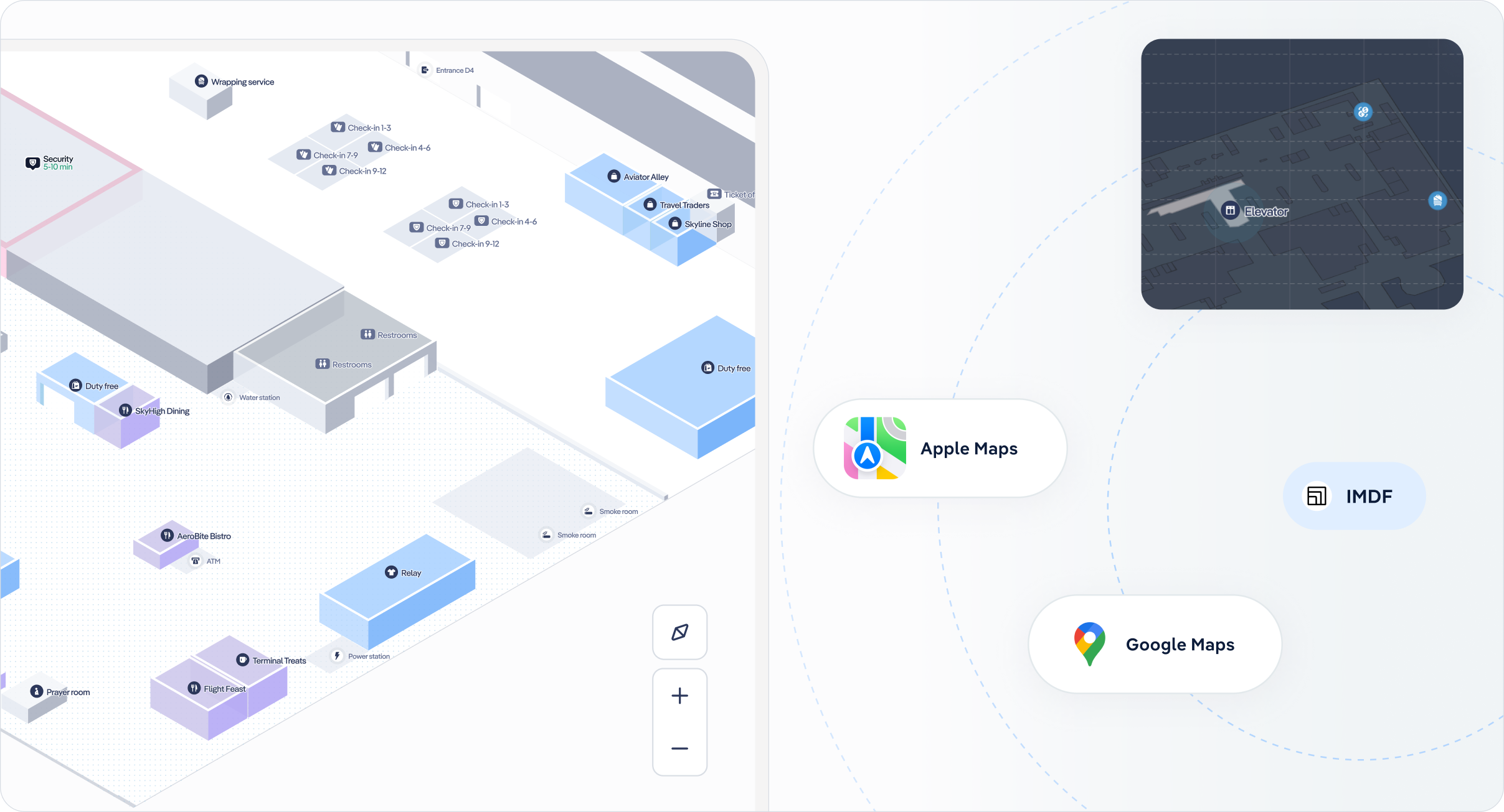
Many airport websites rely on static designs with siloed pages for flight information, transportation options, and terminal services. While this format provides the necessary details, it often requires passengers to jump between pages to piece together their airport journey. This fragmented approach can leave travellers feeling unprepared and disconnected from the terminal layout, making navigation more stressful once they arrive. A more unified, interactive solution can transform the way passengers engage with airport information.
Problem
Let’s first analyse the website traffic for the top 20 European airports to find patterns of user engagement and the key pages likely driving traffic:
1. Website Engagement Trends:
Websites for major airports typically experience high traffic volumes, particularly on pages related to flights (e.g., arrivals, departures, and flight statuses) and transportation options for accessing the airport.
For example, looking at Heathrow Airport’s website traffic in 2024, this is how it distributes across its main pages:
- Flight Information (Arrivals and Departures): 40–50%
- Transportation and Parking: 25–30%
- Terminal Services (Lounges, Shopping, Dining): 10–15%
- Booking Services (Parking, Fast Track, VIP Access): 5–10%
2. Traffic Distribution and Behavior:
- Users typically spend 4–6 minutes per session on airport websites, with bounce rates varying between 25% and 35%. This suggests that most users arrive with a specific query, often related to flight or travel logistics, and navigate away quickly after finding the needed information.
3. Transportation Pages:
- Information on how to get to/from the airport (e.g., taxis, buses, trains, car rentals, and parking facilities) is consistently a secondary driver of traffic after flight-related pages.
- These pages benefit from integration with third-party transportation providers, helping increase user engagement.
4. Regional Insights:
Airports with heavy tourism traffic, such as those in Paris, Rome, and Barcelona, often see spikes in transportation-related queries because tourists seek multimodal transit options.
What does this tell us about the challenges for airport websites?
- Fragmented Information: Travelers frequently search for flight updates or transportation options, but these are often spread across separate pages. Without a unified view, passengers struggle to contextualize how these services fit into their overall journey.
- Missed Opportunities for Engagement: Static, siloed pages typically don’t encourage users to explore other services, such as dining, retail, or lounge options, which limits opportunities for passengers to discover everything the airport has to offer.
- Stress from Unclear Navigation: Tight schedules, large unfamiliar terminals, and limited pre-trip planning tools contribute to passenger stress, particularly for those unsure of how to move seamlessly through the airport.
These issues highlight the need for tools that not only consolidate essential information but also enhance passengers’ understanding of the terminal’s layout and services.
Solution
An interactive 3D map provides an integrated approach that can overcome the limitations of traditional websites:
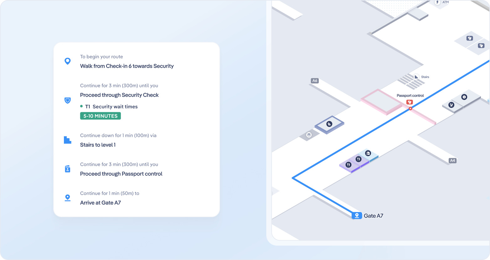
- Contextualizing Services: Instead of having dedicated pages for individual parts of the journey, an interactive map allows users to visualize services and POIs (like gates, transportation hubs, or check-in counters) within the terminal layout. This contextual view helps passengers understand how different steps of their journey are connected.
- Seamless Journey Planning: Users can find all relevant steps in their journey on one platform—such as selecting a transportation mode, navigating to the check-in counter, passing through security, and locating their gate—without needing to switch between siloed pages.
- Encouraging Exploration: By making the map central to their experience, passengers can naturally discover additional services, such as dining and retail options, that they may have otherwise overlooked when browsing static pages.
- Stress Reduction: With a clear, interactive view of the terminal and the ability to plan their journey in advance, passengers feel more confident and less stressed upon arriving at the airport.
Interactive maps consolidate key information into a single, user-friendly experience, making it easier for passengers to visualize, plan, and enjoy their airport journey.
Get in touch with us
Interactive 3D maps offer a modern, cohesive way to improve the passenger experience. Contact us to explore how we can empower your travelers to move seamlessly through their airport journey, discover services, and feel more in control of their experience.
In today’s fast-paced airport environment, self-service kiosks have become essential for improving efficiency and passenger satisfaction. By integrating interactive mapping technology, airports can further enhance these kiosks offering seamless wayfinding, reducing passenger stress, and unlocking new revenue opportunities.
Problem
Airports face persistent challenges in balancing operational efficiency with passenger satisfaction:
- High Operational Costs: Staff are often tied up with repetitive tasks like giving directions.
- Missed Revenue Opportunities: Poor navigation means passengers may overlook dining, retail, or services.
- Stressful Passenger Journeys: Navigating complex airport layouts with limited signage can frustrate travellers, especially international visitors.
Let’s look at key trends to see how self-service kiosks are already addressing these challenges.
1. Passenger Preferences:
- 70% of travelers prefer self-service options, driven by reduced wait times and greater convenience.
- 38% of travelers interact with kiosks for services like maps, retail information and 15% of users choose the language option.
2. Efficiency and Revenue Impact:
- Airports using kiosks with interactive maps report a 10-12% increase in retail traffic as passengers are guided to shops and dining options in their proximity or on the way to the gate.
- According to our studies, over 50% of the inquiries fielded by information desk personnel are related to wayfinding – passengers simply trying to find their way to gates, shops, or services.
These trends highlight how kiosks are evolving into powerful tools for improving efficiency and passenger journeys while driving airport revenue growth.
Solution: Interactive Mapping for Self-Serve Kiosks
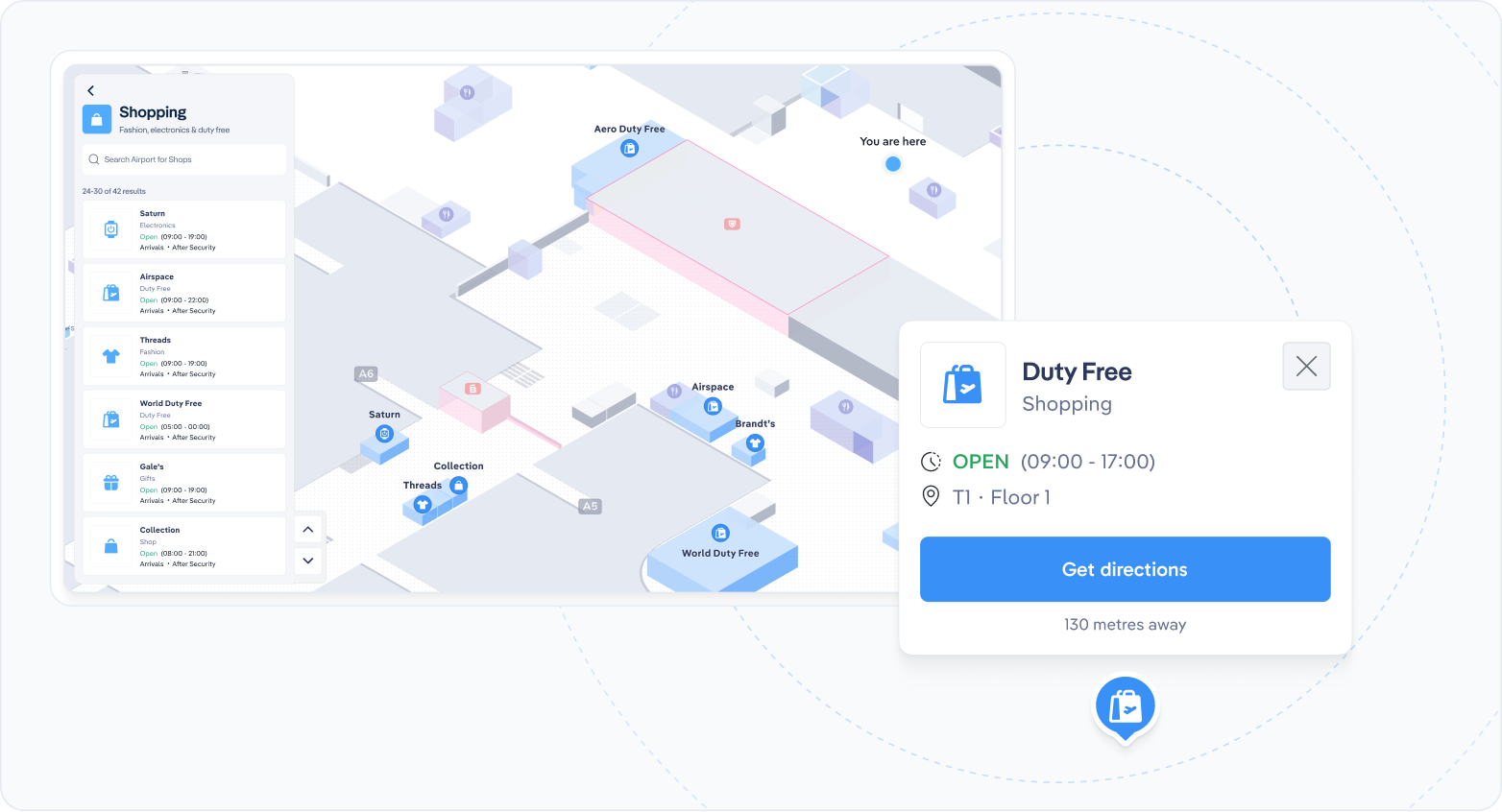
Our interactive mapping platform for self-serve kiosks directly addresses these challenges:
- Cost Efficiency: Automating wayfinding reduces repetitive inquiries, freeing staff to focus on more critical tasks and cutting operational costs.
- Improved Passenger Experience: Real-time, intuitive maps guide passengers to gates, amenities, and services. Features like multilingual support and integrated flight updates further reduce stress and enhance satisfaction.
- Increased Revenue: Guided wayfinding boosts retail and dining traffic, while promotions and personalised recommendations encourage additional spending.
Get in touch with us
Self-service information kiosks are an increasingly vital tool in airports, providing passengers with interactive ways to access flight information, maps, shopping, dining options, and transportation details.
Transform your airport’s self-service kiosks with interactive mapping technology. Contact us to learn how we can help optimise staffing, enhance passenger satisfaction, and unlock new revenue streams for your airport.
Many airport websites rely on static designs with siloed pages for flight information, transportation options, and terminal services. While this format provides the necessary details, it often requires passengers to jump between pages to piece together their airport journey. This fragmented approach can leave travellers feeling unprepared and disconnected from the terminal layout, making navigation more stressful once they arrive. A more unified, interactive solution can transform the way passengers engage with airport information.
Problem
Let’s first analyse the website traffic for the top 20 European airports to find patterns of user engagement and the key pages likely driving traffic:
- Website Engagement Trends: Websites for major airports typically experience high traffic volumes, particularly on pages related to flights (e.g., arrivals, departures, and flight statuses) and transportation options for accessing the airport. For example, looking at Heathrow Airport’s website traffic in 2024, this is how it distributes across its main pages:
Flight Information (Arrivals and Departures): 40–50%
Transportation and Parking: 25–30%
Terminal Services (Lounges, Shopping, Dining): 10–15%
Booking Services (Parking, Fast Track, VIP Access): 5–10%
- Traffic Distribution and Behavior: Users typically spend 4–6 minutes per session on airport websites, with bounce rates varying between 25% and 35%. This suggests that most users arrive with a specific query, often related to flight or travel logistics, and navigate away quickly after finding the needed information.
- Transportation Pages: Information on how to get to/from the airport (e.g., taxis, buses, trains, car rentals, and parking facilities) is consistently a secondary driver of traffic after flight-related pages. These pages benefit from integration with third-party transportation providers, helping increase user engagement.
- Regional Insights: Airports with heavy tourism traffic, such as those in Paris, Rome, and Barcelona, often see spikes in transportation-related queries because tourists seek multimodal transit options.
Solution
An interactive 3D map provides an integrated approach that can overcome the limitations of traditional websites:
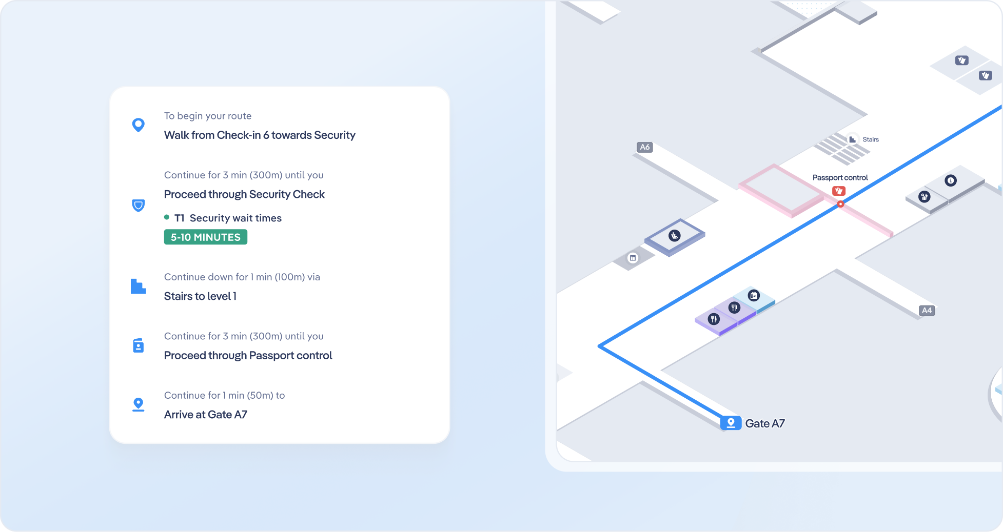
- Contextualizing Services: Instead of having dedicated pages for individual parts of the journey, an interactive map allows users to visualize services and POIs (like gates, transportation hubs, or check-in counters) within the terminal layout. This contextual view helps passengers understand how different steps of their journey are connected.
- Seamless Journey Planning: Users can find all relevant steps in their journey on one platform—such as selecting a transportation mode, navigating to the check-in counter, passing through security, and locating their gate—without needing to switch between siloed pages.
- Encouraging Exploration: By making the map central to their experience, passengers can naturally discover additional services, such as dining and retail options, that they may have otherwise overlooked when browsing static pages.
- Stress Reduction: With a clear, interactive view of the terminal and the ability to plan their journey in advance, passengers feel more confident and less stressed upon arriving at the airport.
Interactive maps consolidate key information into a single, user-friendly experience, making it easier for passengers to visualize, plan, and enjoy their airport journey.
Get in touch with us
Interactive 3D maps offer a modern, cohesive way to improve the passenger experience. Contact the Airsiders’ team to explore how we can empower your travellers to move seamlessly through their airport journey, discover services, and feel more in control of their experience.
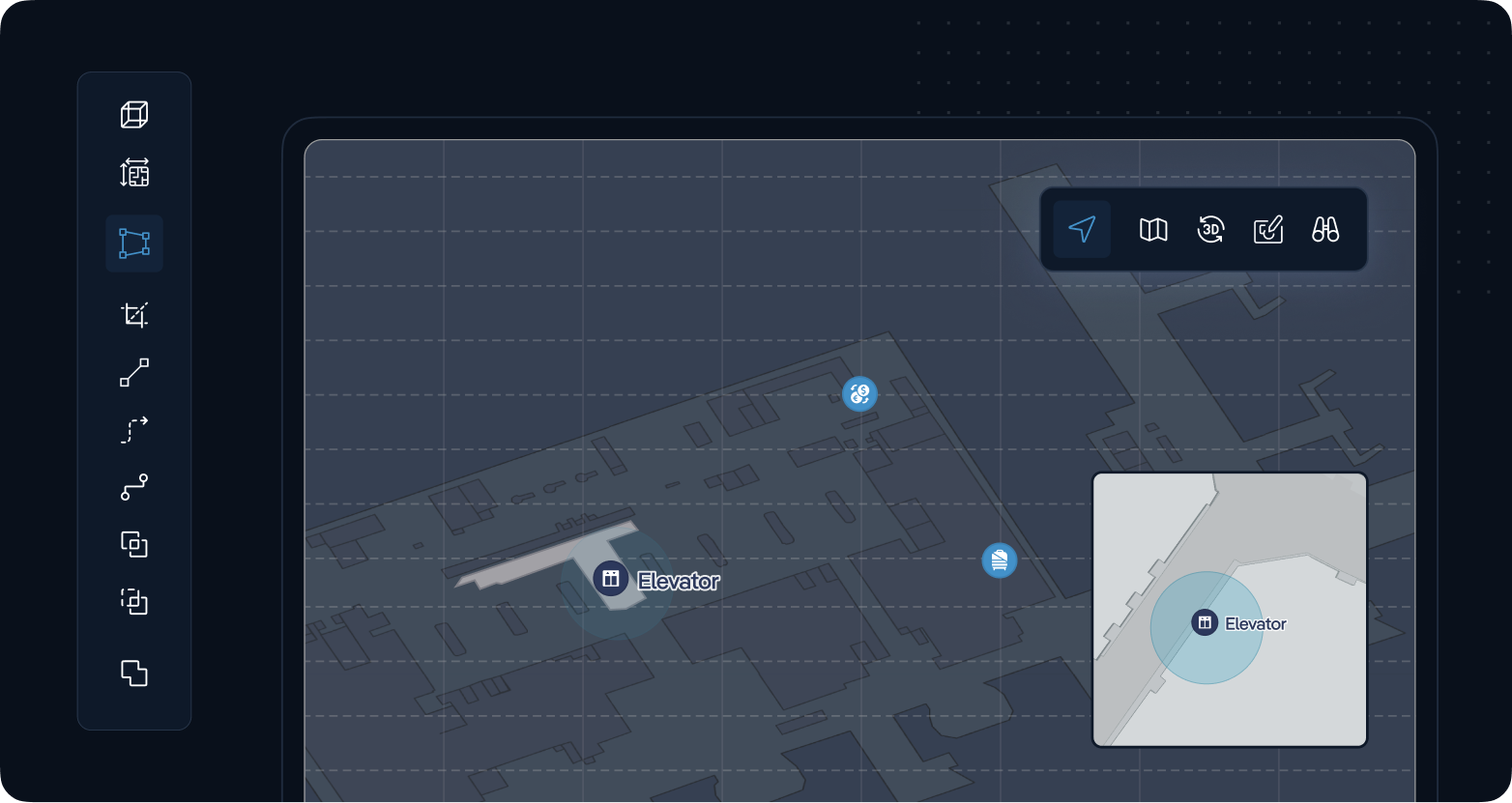
As airports evolve, the need for precise, easily accessible, and standardized digital maps becomes paramount. Our platform helps airports transform their map data into IMDF (Indoor Mapping Data Format), making it seamless to integrate with global platforms like Google Maps and Apple Maps. Through our solution, airports can offer passengers up-to-date, detailed layouts, improving the overall airport experience while enhancing operational efficiency.
The challenge of IMDF for airports
Airports store map data in varied formats: some are static, others use CAD files, and some employ custom digital solutions. This diversity in storage methods can make it challenging to maintain consistent and accessible maps across platforms. Additionally, Google and Apple Maps have the largest market share globally, reaching billions of people daily, while the audience of an airport’s website remains limited. Integrating with these popular mapping platforms allows customers to find airport-specific information in the apps they already use every day, providing a seamless experience.
However, converting and maintaining IMDF and integrating it with Google and Apple Maps is technically resource-intensive. It requires specialized talent and tools to manage data updates and ensure accuracy, which can strain an airport’s internal resources.
How can AirportCompass support?
Our platform streamlines the entire process, from converting your airport’s existing map data into the IMDF format to facilitating seamless uploads to Google Maps and Apple Maps. With our solution, you’ll benefit from:
- Efficient Conversion: We convert your maps into the IMDF format, creating standardized data that’s globally accepted.
- Platform Integration: We simplify uploading the IMDF data to Google and Apple Maps, ensuring passengers access accurate layouts.
- Ongoing Maintenance: Airports change constantly. Our platform supports continuous data maintenance, so your maps stay current and accurate across all platforms without burdening your internal team.
With our support, airports gain not only a consistent and professional digital presence but also enhanced passenger satisfaction through easily navigable, reliable maps.
Get in touch with us
Ready to elevate your airport’s digital mapping experience? Contact us to learn more about how our platform can streamline IMDF conversion, platform integration, and ongoing data maintenance for your airport.
