Enhancing Airport Websites with Interactive 3D Maps
Many airport websites rely on static designs with siloed pages for flight information, transportation options, and terminal services. While this format provides the necessary details, it often requires passengers to jump between pages to piece together their airport journey. This fragmented approach can leave travellers feeling unprepared and disconnected from the terminal layout, making navigation more stressful once they arrive. A more unified, interactive solution can transform the way passengers engage with airport information.
Problem
Let’s first analyse the website traffic for the top 20 European airports to find patterns of user engagement and the key pages likely driving traffic:
- Website Engagement Trends: Websites for major airports typically experience high traffic volumes, particularly on pages related to flights (e.g., arrivals, departures, and flight statuses) and transportation options for accessing the airport. For example, looking at Heathrow Airport’s website traffic in 2024, this is how it distributes across its main pages:
Flight Information (Arrivals and Departures): 40–50%
Transportation and Parking: 25–30%
Terminal Services (Lounges, Shopping, Dining): 10–15%
Booking Services (Parking, Fast Track, VIP Access): 5–10%
- Traffic Distribution and Behavior: Users typically spend 4–6 minutes per session on airport websites, with bounce rates varying between 25% and 35%. This suggests that most users arrive with a specific query, often related to flight or travel logistics, and navigate away quickly after finding the needed information.
- Transportation Pages: Information on how to get to/from the airport (e.g., taxis, buses, trains, car rentals, and parking facilities) is consistently a secondary driver of traffic after flight-related pages. These pages benefit from integration with third-party transportation providers, helping increase user engagement.
- Regional Insights: Airports with heavy tourism traffic, such as those in Paris, Rome, and Barcelona, often see spikes in transportation-related queries because tourists seek multimodal transit options.

Solution
An interactive 3D map provides an integrated approach that can overcome the limitations of traditional websites:
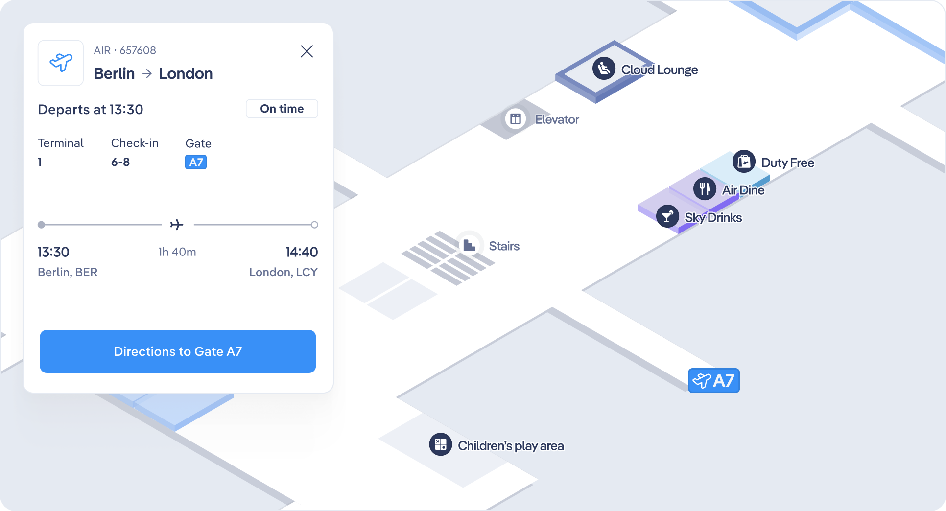
- Contextualizing Services: Instead of having dedicated pages for individual parts of the journey, an interactive map allows users to visualize services and POIs (like gates, transportation hubs, or check-in counters) within the terminal layout. This contextual view helps passengers understand how different steps of their journey are connected.
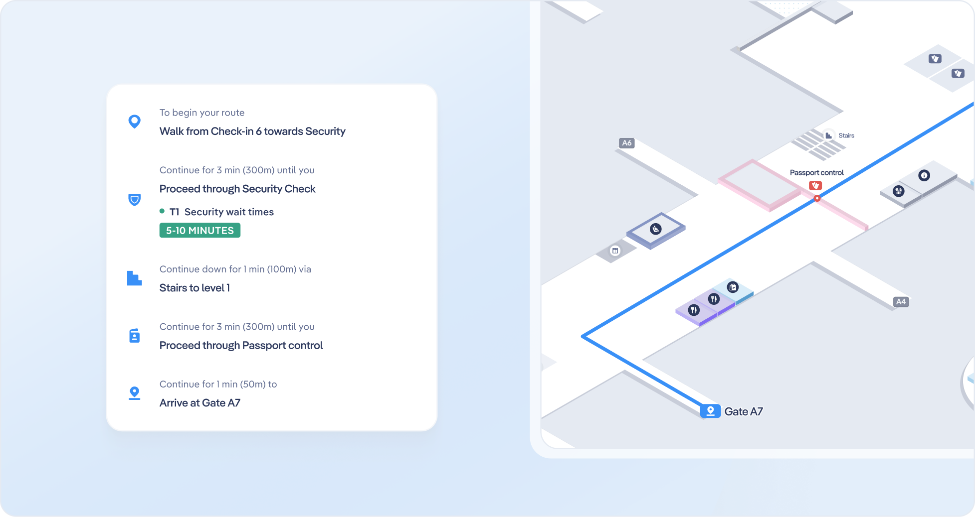
- Seamless Journey Planning: Users can find all relevant steps in their journey on one platform—such as selecting a transportation mode, navigating to the check-in counter, passing through security, and locating their gate—without needing to switch between siloed pages.
- Encouraging Exploration: By making the map central to their experience, passengers can naturally discover additional services, such as dining and retail options, that they may have otherwise overlooked when browsing static pages.
- Stress Reduction: With a clear, interactive view of the terminal and the ability to plan their journey in advance, passengers feel more confident and less stressed upon arriving at the airport.
Interactive maps consolidate key information into a single, user-friendly experience, making it easier for passengers to visualize, plan, and enjoy their airport journey.
Get in touch with us
Interactive 3D maps offer a modern, cohesive way to improve the passenger experience. Contact the Airsiders’ team to explore how we can empower your travellers to move seamlessly through their airport journey, discover services, and feel more in control of their experience.
Back to all articles
